Calligraphers Bring Regulations to a Font Fight
A fight between China’s design and calligraphy worlds has spilled over into its national legislature, after a minor political party asked the government to help eliminate tacky calligraphy-inspired fonts.
The proposal, submitted in late February, calls for an “authoritative art committee” to evaluate fonts in order to “ensure that jianghu fonts are eliminated,” and protect “the masses’ aesthetic understanding of calligraphy.” It calls for the government to purge the fonts from font libraries used by computers and publishers, and to introduce new fonts based on real calligraphy. The motion will be reviewed at China’s annual “Two Sessions” legislative meetings, which started today.
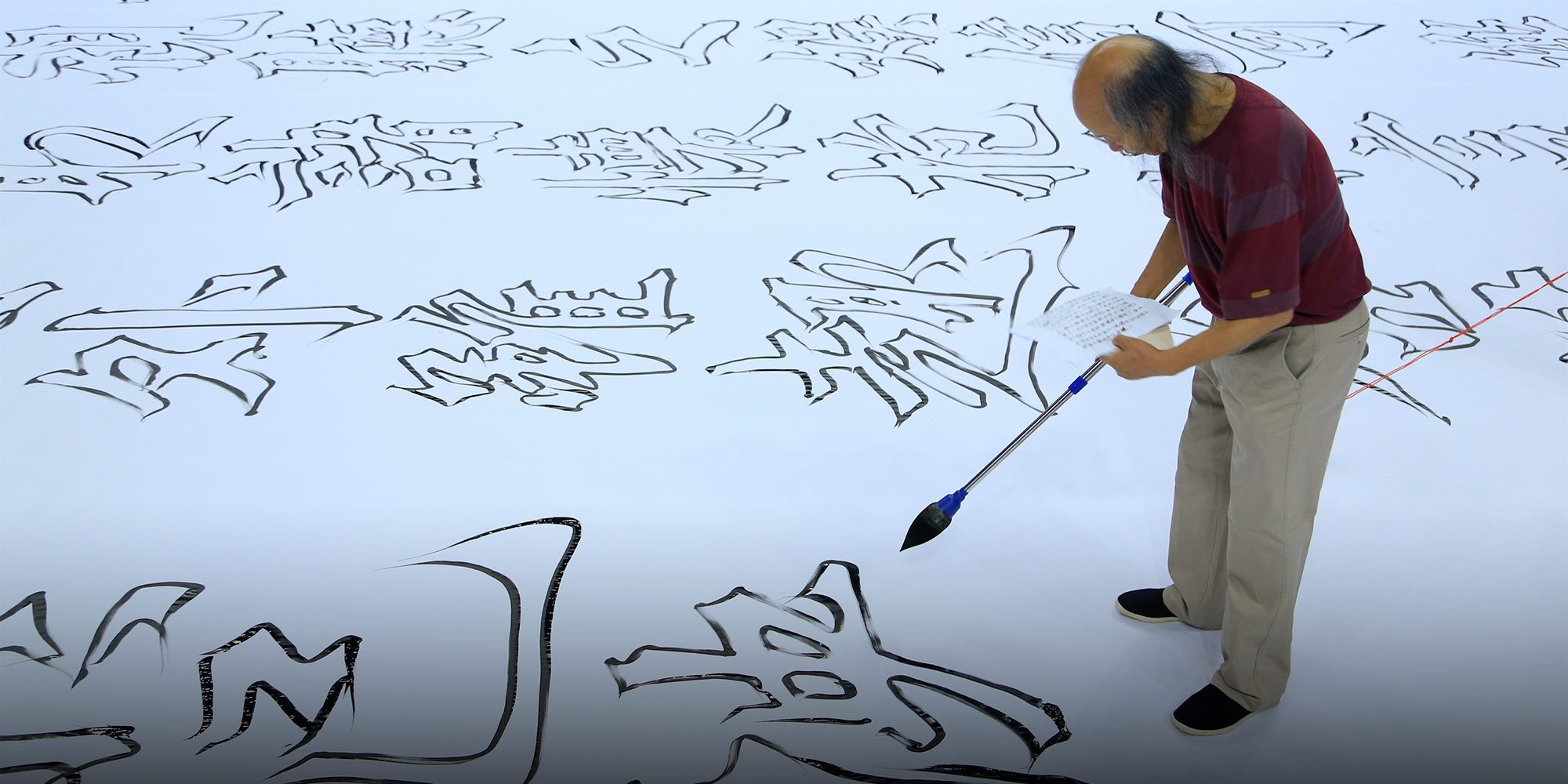
Jianghu describes the kind of font often seen on Chinese movie posters, resembling big, bold strokes of a wide brush, emulating the look of traditional calligraphy. The term — literally “rivers and lakes” — evokes the swashbuckling settings of Chinese historical fiction.
The dominant Chinese type font known as Songti or Mingti has its roots in traditional calligraphy, and many modern fonts were created by calligraphers. But jianghu fonts exaggerate the hand-written look.
Many calligraphers say they're hideous.
In 2019, calligrapher Zhang Shouchang published an anti-jianghu broadside in the Hubei province-based Calligraphy Newspaper. He criticized China’s two major font companies, Founder Type and Hanyi Fonts, for fuelling an epidemic of pseudo-calligraphic fonts in ads, film posters, and even national broadcasters.
Zhang feared that people would mistake calligraphy-style fonts for the real thing. “Jianghu fonts entering the font library are like a virus entering the blood,” he wrote. “It not only subverts the calligrapher’s pursuit of perfection, but also disrupts the whole society’s understanding of the beauty of calligraphy.”
Calligraphers say the fonts use cheap tricks to get attention. Zhang’s article called out designer Shang Wei, also known as SAVI, who designed a number of successful fonts while in his 20s. His fonts were used in many film posters, including the 2018 hit “Dying to Survive.” Shang died from a car accident in 2021 at 31.
Liu Yuli, a jianghu-accepting type designer and cofounder of design studio atelierAnchor, explains that calligraphers see the fonts as overusing attention-grabbing tricks. (Liu recently wrote about the history of Chinese digital fonts for Sixth Tone.)
“The characters in Shang’s font all have a big na stroke, and the weight of each character leans to the lower right. It makes the works look very iconic and powerful,” Liu told Sixth Tone. The na stroke sweeps down and to the right. “However, it breaks a taboo to write all of your nas so big in traditional calligraphy; calligraphy is about flexibility and changeability.”
Zhang’s article went viral, and made jianghu something of a dirty word in the type community. Liu says that designers have started calling them “brush fonts” (maobi ziti) instead.
The party behind the anti-jianghu proposal, the China Association for Promoting Democracy, is one of China’s eight legally recognized minor political parties, which sit in its legislature as part of the country’s “United Front” system. The party’s Lin Yang, a former editor-in-chief of the China Art Publishing House, made a similar proposal for a jianghu ban last year.
At the end of the day, Liu said that the standards of fine art calligraphy aren’t always right for commercial fonts.
“China has always attached great importance to the standards of writing and typing. When we are in primary school, we are required to write a dot as a dot; we can’t make it look like a na. But I think such strictness isn’t appropriate except in newspapers and television,” Liu said. “I hope some unconventional designs will still be acceptable.”
Editor: David Cohen.
(Header image: Wang Yuan/CNS/VCG)