The Fonts That Made China’s Digital Revolution Possible
Turn on your mobile phone, set the system language to “Chinese,” and watch as the interface instantly converts to Chinese text. Now, look closely at the characters. At first glance, their component strokes seem to have a consistent thickness reminiscent of Latin Sans Serif typefaces like Helvetica.
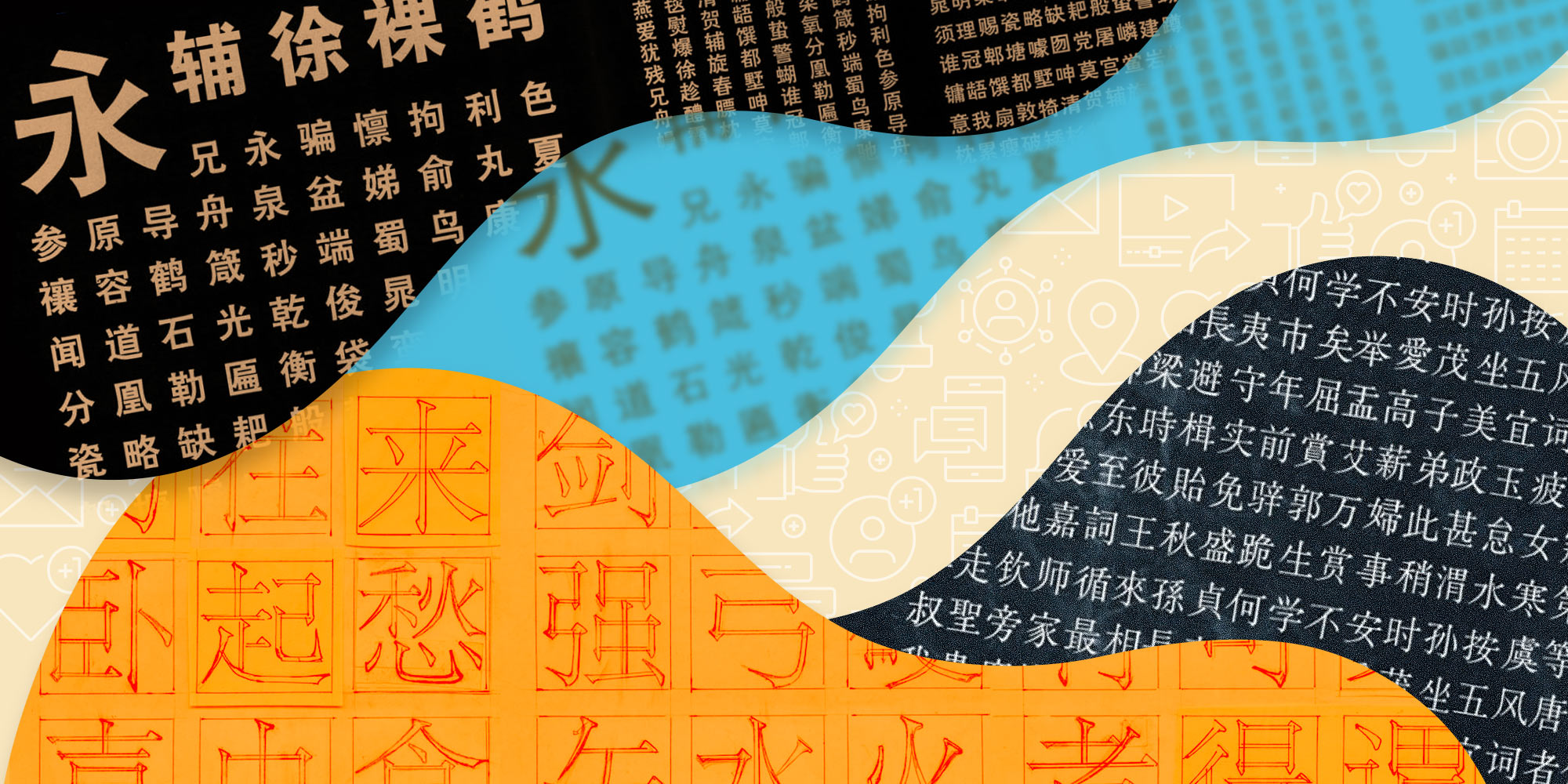
This type of Chinese font is known as Heiti. Literally “black-style,” Heiti is the dominant family of digital fonts in use on Chinese phones and computers around the world. It is also starkly different from the more delicate Songti, or “Song Dynasty-style” typeface preferred by Chinese printers for books, newspapers, and other forms of literature for centuries.
Together, Heiti and Songti are the two leading modern Chinese typefaces. Songti is by far the older of the two, though it’s not quite as old as the name suggests. Indeed, somewhat confusingly, what is now known as Songti is actually a product of the Ming Dynasty (1369-1644), when engravers and printers developed elements of earlier Song Dynasty (960-1279) printed characters into a full-fledged script style. This style is marked by strokes of differing thickness with distinctive Serif-like decorative marks at their ends, sometimes known as “little triangles” in Chinese. Today, although typographers on the Chinese mainland prefer to refer to this script as Songti, it is known as Mingti elsewhere, including Taiwan.
The rise of Heiti is far more recent — and straightforward. It is the result of the collision of Eastern and Western cultures in the second half of the 19th century. As modern lead-based movable type was introduced to East Asia, Japanese type foundries took inspiration from the Latin typeface style known as Grotesque, applying its monolinear strokes of consistent thickness to Chinese characters to create the so-called “Gothic” (gochikku, later known as goshikku) typeface. Gothic-based typefaces were soon introduced to China and imitated by local type foundries, where readers took note of their thick, black strokes and renamed the style Fangtouti (“square end typefaces”) or Heiti.
Heiti typefaces from the printing age are distinct from the fonts you’ll find on your phone, in part because early Heiti was designed in line with the aesthetics of traditional Chinese calligraphy. Unlike the Grotesque typeface, the strokes used in Heiti characters were not uniformly thick; rather, they flared out at the ends, imitating the way a calligrapher’s brush lingers at the beginning and end of each stroke. This both gave the script a dignified and balanced appearance and made up for some of the shortcomings of printing technology. In those days, text was often distorted during the printing process, due to overflowing ink in early metal type printing setups, or the blurring characteristic of later phototypesetting systems. In both cases, keeping the flared strokes helped make the outlines of ideograms clearer and more legible to readers.
Another sea change in Chinese printing came after the founding of the People’s Republic in 1949. In the 1950s, the new regime launched a campaign to simplify Chinese characters. This move had an immediate effect on font designs; in 1960, when the Shanghai Institute of Printing Technology was established, the first major task its workers were given by the government was to design a new set of Chinese typefaces for the “Cihai,” one of the nation’s most authoritative dictionaries.
The Institute’s designers drew inspiration from the fonts of documents and newspapers both Chinese and foreign to create the “Songti No. 1” and “Heiti No. 1” typefaces for the dictionary’s main text and headers, respectively. Later, they designed “Songti No. 2” and “Heiti No. 2” for use in the “Selected Works of Mao Zedong.” The typefaces used in these two books set a new standard in the Chinese publishing industry, and — alongside Fangsong and Kaiti, both of which more closely resemble Chinese as it is written by hand — became known on the Chinese mainland as the “four major typefaces.”
Although Heiti had established itself as a mainstream typeface by the end of the 1960s, it continued to be used primarily for document headings until the 1980s. Typesetters of the period valued it not for its clarity, but for its thickness, or “weight,” which offered a meaningful contrast with the lighter Songti typefaces typically used for the main body of texts.
Around this time, however, the need for new, clearer typefaces was crystalizing alongside the emergence of the personal computer. When Apple and Microsoft started to localize their operating systems for Chinese consumers, Chinese-language digital fonts were mostly designed in a 16-pixel dot matrix. Simply put, what this means is that each Chinese character was designed to occupy a 16- by 16-pixel square. Yet these typefaces appeared too large compared to English-language interfaces, which generally used a smaller font size, anywhere from nine to 13 pixels.
To address this problem, Mac OS and Windows adopted the Beijing and SimSun fonts, respectively. Essentially low-resolution versions of Songti typefaces, Beijing and SimSun allowed developers to display characters at much smaller font sizes than before, though not without a loss in detail: Many of Songti’s distinctive Serif-like details disappeared as the characters shrunk in size.
In 2001, Apple set out to refresh its brand image, including by conducting a sweeping overhaul of its user interfaces. Over the course of the 1990s, new technologies like vectorial modeling — which used mathematical formulas to preserve the proportions of characters regardless of how many pixels were used — had greatly improved the utility and legibility of fonts, and the company wanted a new system font for its Chinese-language operating systems that could take advantage of these advances.
It found one in the small eastern Chinese city of Changzhou. In 1991, the Chinese-American font designer and University of California, Berkeley alumnus Curt Huang founded the SinoType company. By the end of the decade, SinoType had created vectorial versions of all four major typefaces for use in desktop publishing.
Thanks in part to Huang’s connections in Silicon Valley, his company’s font was chosen by Apple as the new system font for the Chinese version of Mac OS. Rather than continuing to use Songti, however, Apple opted for SinoType’s Heiti variant, in part for legibility, and in part because it was closer to the operating system’s base Sans Serif-style font, Lucida Grande.
Interestingly, because Huang worked with traditional local foundries in Changzhou to develop his typefaces, SinoType Heiti has a distinctly old-school feel relative to other digital-era Heiti fonts. Most notably, it maintains early Heiti’s distinctive flares, despite them taking up half or sometimes even entire extra pixels when displayed digitally. This was more about design than utility: In Mac OS’s rendering scheme, half-pixels were displayed in grey rather than black, which made some SinoType characters appear faded or blurry.
Meanwhile, Windows continued using a pixel-based user interface font until 2006, when its new Vista operating system introduced Microsoft Yahei, a Heiti font specifically designed for screen displays, featuring a squarish appearance and monolinear strokes of uniform thickness. For the sake of clarity, Yahei’s developers intentionally distorted character outlines below a certain font size, allowing them to better fit the pixel grid.
In other words, when it came to on-screen representation of Chinese fonts, Windows and Mac OS took two different approaches: The former was willing to warp style in the pursuit of clarity, while the latter preserved style even at clarity’s expense. Both, however, opted for Heiti.
Just a few years later, the popularization of smartphones would further entrench Heiti’s digital dominance. When the Android operating system was launched, its initial system font used a Heiti font with a uniform stroke thickness that made characters legible even on small screens. Early iPhones stuck with Apple’s preferred SinoType Heiti as their Chinese-language system font, though many Chinese iPhone users only noticed the font’s distinctive flared design when the company released its upgraded Retina display in 2010. The font eventually became so associated with Apple in China that, after the company switched to “PingFang” — a new Heiti font without the characteristic flares of Sinotype’s version — in 2015, many users had trouble getting used to it; ironically, some even complained that they missed the characteristically “Apple” approach to design embodied in the SinoType font.
The rise of Yahei and Pingfang has ushered in something of a golden age for Chinese font design, at least commercially, as more and more tech companies are demanding their own fonts. Although this has benefitted font designers and allowed the industry to attract investment, the truth is that there are now so many Heiti fonts specifically designed for mobile devices that overlap between them is all but guaranteed, and few consumers can tell the difference anymore. For hardware companies like Xiaomi, Huawei, and Oppo, however, the development and integration of new fonts is not about increasing the legibility of their product interfaces so much as cultivating a brand image centered on innovation and optimized user experiences.
As for Songti, while it once appeared to be on the verge of obsolescence, it now seems primed for a comeback. As display technologies have advanced to the point that they no longer place constraints on fonts, Songti has enjoyed a resurgence in popularity: Many mobile reading applications and even some news websites have re-adopted the Heiti-Songti header-main body hierarchy — returning to a publishing style that Chinese typographers used for decades.
With its distinct lack of embellishments or superfluous strokes, Heiti is perhaps an embodiment of the early digital era’s emphasis on efficiency above all else. But we shouldn’t take its compromises for granted: All in all, it’s a fairly bland style. Heiti does its job well, but there’s no reason we can’t make room for a more diverse typographical future.
Translator: Lewis Wright; editors: Cai Yineng and Kilian O’Donnell; visuals: Ding Yining; portrait artist: Wang Zhenhao.
(Header image: Visual elements from Xu Xuecheng Archives/shanghaitype.org and People Visual, reedited by Sixth Tone)