How a 300-Year-Old Dictionary Birthed China’s Comic Sans
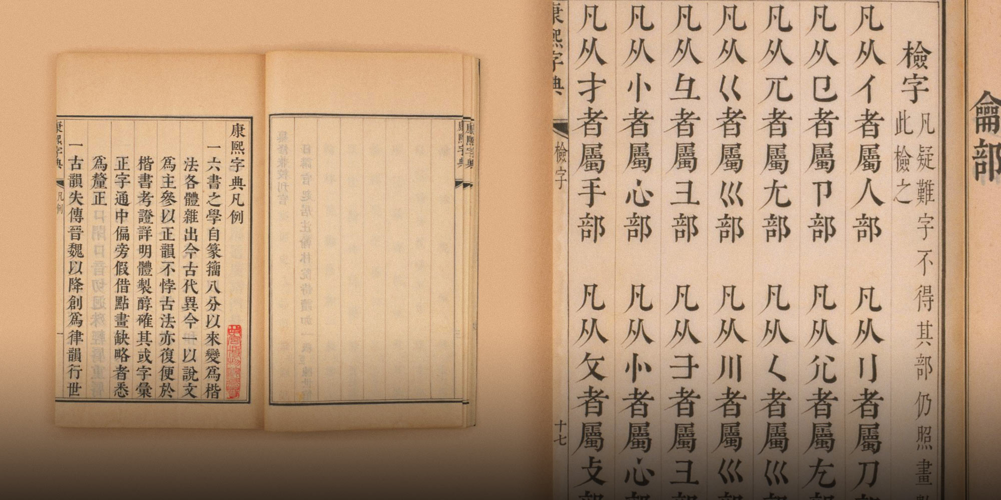
In 2010, a young type designer named Li Xiangchen extracted over 47,000 Chinese characters from a photocopy of the 300-year-old Kangxi Dictionary and used them to create a rudimentary digital font. Although Li’s original motivation was more academic than commercial, his Kangxi Dictionary-based font made an immediate impression. Within a few years, it was seemingly everywhere, from milk tea shops to posters detailing China’s “core socialist values.”
The Kangxi Dictionary’s compilers would likely have been puzzled by the typeface’s popularity, if not its commercial utility. The typeface belongs to a category known in Chinese typography as “woodblock print characters,” which, as the name suggests, were primarily used in books produced via woodblock printing.
Whatever their current appeal, these characters had little aesthetic value to the people who made them. Invented during the Tang Dynasty (618-907), woodblock printing was a laborious process. To create a single-page woodblock, scribes first wrote the characters on paper before transferring the text in reverse onto a wooden block, which engravers then chiseled down to produce raised characters suitable for use in printing.
Woodblock printing became the default for “mass-market” literature and classic works of philosophy in medieval and early modern China. Even after the advent of movable type printing during the Northern Song dynasty (960-1127), printers continued to use woodblock presses for key titles like the Confucian Four Books and Five Classics.
That’s not to say character styles remained static. At first, engravers sought to faithfully reproduce the shape of handwritten characters, typically the then-standard kaishu script. The result was nearly indistinguishable from characters written with a brush.
Of course, if you have ever carved wood, then you know it is far easier to carve straight lines than the curves of handwritten Chinese characters. Thus, in the face of rising demand and in the pursuit of efficiency, engravers began taking shortcuts; in the process, they reshaped China’s relationship with the written word.
The shape of characters in printed works began noticeably deviating from that of brush characters during the Southern Song Dynasty (1127-1279). While they retained a handwritten feel, their outlines grew rigid in a style that we now know as Song-style typeface, or Songti. During the Ming Dynasty (1368-1644), engravers went even further, straightening all the horizontal and vertical strokes to create what is now known as the Ming-style typeface, also known as Mingti.
For members of China’s literati, these printed scripts were unlively, uninspiring, and bland, at least relative to handwritten calligraphy. What, then, accounts for the Kangxi Dictionary typeface’s modern-day popularity?
One key lay in its production method. Having started as an academic project, Li Xiangchen’s Kangxi Dictionary font kept the original shape of the characters, not as they were originally carved, but as they appeared in his photocopied Kangxi Dictionary. This included the incertitude of the knifework, the natural wear and tear of the woodblock, the unevenness of the ink printed on the paper, and the fraying of the book over time. Those factors were more or less integrated into his font, giving it a nostalgic charm that resonated with a mass audience.
The font also benefitted from factors outside Li’s control. Just two years before Li created his Kangxi Dictionary font, Zhang Yimou staged his spectacular Beijing Olympics opening ceremony. The event was essentially a paean to Chinese history and culture — including a tremendous segment featuring 897 movable-type printing blocks, each operated by a performer, rising out of the floor of the Bird’s Nest stadium. Linking the country’s ascent with its historical and cultural achievements, the show underscored a growing cultural confidence and hunger for tradition among the Chinese public.
But the popularity of Kangxi Dictionary-style fonts was hardly limited to the Chinese mainland. Pirated font files quickly spread to Taiwan, which never adopted simplified Chinese, and where the font was embraced in some corners as an even “truer” form of traditional characters. Soon, the typeface was all over the island, from traditional food stalls to coffee shops, historical book covers, pet photo albums, property advertisements, musical albums, and even campaign ads.
Unsurprisingly, the mass popularity of the font engendered a backlash. Typophiles began shunning it; one even started a blog called “No More Kangxi Dictionary Font” that collected examples of the font’s misuse.
Some of the concerns surrounding Li’s font were fair. For one, it was mechanically converted from images into outlines with no fixes, adjustments, optimization, or other touch-ups, making its size and line placements inconsistent and uneven.
In retrospect, between its shortcomings and overuse, the Kangxi Dictionary typeface’s decline was probably inevitable. It eventually came to occupy a status not unlike that of Comic Sans in the English-speaking world, and younger designers often have a hard time imagining just how pervasive it used to be.
Nevertheless, it is a time capsule of sorts: a window back into the early days of China’s traditional culture craze. Prior to 2010, the default method for expressing “traditional Chinese culture” via typeface was through the use of calligraphy-style script. The Kangxi Dictionary typeface broadened the mindsets of designers, who began to seek inspiration in Chinese characters from different eras and media. While these newly developed, digital woodblock print characters drew heavily from their ancient counterparts, their designers have adopted a far more professional approach: doing away with the wear-and-tear look and other unintended side effects of ancient printing while staying true to the original shape of the characters.
At the end of the day, the current popularity of woodblock print characters is less about their intrinsic aesthetic beauty and more about their relationship to the Chinese tradition. Blocky Song- and Ming-style typefaces might lack the elegance of calligraphy, but they stand testament to the mass expansion in literary culture enabled by the development of printing technology. Similarly, typefaces based on Republican-era Chinese printed materials immediately call to mind that era of drastic cultural change.
Designers are constantly borrowing from and reinterpreting history. Just as today’s designers use ancient engravings and more recent drawings to pay homage to China’s past, modern-day digital typefaces, memes, and video effects will one day form the basis of retro- or history-based typefaces. And who knows, with enough time and distance, perhaps even the Kangxi Dictionary typeface will get a second chance to make a first impression.
Translator: Katherine Tse; editors: Cai Yineng and Kilian O’Donnell.
(Header image: Details of The Kangxi Dictionary. Courtesy of The Palace Museum)